TableView
Clicking an Empty Row
By default, a TableView component does not clear the selection when the user clicks an empty row. This is often unintuitive.
One way to detect clicks on empty rows is to attach a setOnMouseClicked listener to each row. The listener checks whether the clicked row is empty and clears the selection if it is.
tableView.setRowFactory(tv -> {
    TableRow<MyData> row = new TableRow<>();
    row.setOnMouseClicked(event -> {
        if (row.isEmpty()) {
            tableView.getSelectionModel().clearSelection();
        }
    });
    return row;
});
Filtering Rows
This example is fairly long; you can find the complete version on GitHub.
The TableView component does not directly support row filtering. JavaFX provides the FilteredList class, which enables filtering.
Assume we have tasks and categories. Each task belongs to exactly one category. We would like to choose a category from a drop-down menu and display only the tasks belonging to that category.
Task and Category might look like the following:
package fi.jyu.ohj2.examples.filteredlist;

 import javafx.beans.property.ObjectProperty;
 import javafx.beans.property.SimpleObjectProperty;
 import javafx.beans.property.SimpleStringProperty;
 import javafx.beans.property.StringProperty;


public class Task {

    private final StringProperty title = new SimpleStringProperty();
    private final ObjectProperty<Category> category = new SimpleObjectProperty<>();

    public Task() {
        // Required by Jackson
    }

    public Task(String title, Category category) {
        this.title.set(title);
        this.category.set(category);
    }

    // Title
    public void setTitle(String title) {
        this.title.set(title);
    }

    public String getTitle() {
        return title.get();
    }

    public StringProperty titleProperty() {
        return title;
    }

    // Category
    public void setCategory(Category category) {
        this.category.set(category);
    }

    public Category getCategory() {
        return category.get();
    }

    public ObjectProperty<Category> categoryProperty() {
        return category;
    }
}
The user interface might look something like this:
We have a TableView for displaying tasks, a CheckBox for enabling filtering, and a ComboBox for selecting a category.
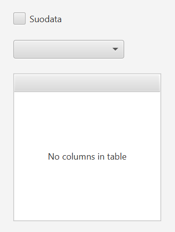
Create an fx:id for each component and corresponding fields in the controller.
Add a FilteredList<Task> attribute called filteredTasks to the controller.
After loading tasks and categories, for example from a JSON file, create a FilteredList object and assign it as the data source for the TableView:
// Assume tasks have been loaded into an ObservableList called 'tasks'
filteredTasks = new FilteredList<>(tasks, t -> true);
tableView.setItems(filteredTasks);
Here, t -> true is a lambda expression that determines which tasks are displayed.
Initially, all tasks are shown because the condition is always true.
Next, add a listener to the ComboBox that updates the filtering criteria:
comboBox.setOnAction(event -> {
    updateFilter();
});

private void updateFilter() {
    Category selectedCategory = comboBox.getSelectionModel().getSelectedItem();
    filteredTasks.setPredicate(t ->
        t.getCategory().getName().equals(selectedCategory.getName())
    );
}
Here, the setPredicate method defines the filtering criteria.
If no category is selected, all tasks should be displayed. Otherwise, only tasks belonging to the selected category should be shown.
However, this implementation has a problem: once filtering has been enabled, it cannot be removed.
For that reason, we added a CheckBox component that can activate and deactivate filtering.
Modify the updateFilter method as follows:
private void updateFilter() {
    Category selectedCategory = comboBox.getSelectionModel().getSelectedItem();
    if (checkBox.isSelected() && selectedCategory != null) {
        filteredTasks.setPredicate(t ->
            t.getCategory().getName().equals(selectedCategory.getName())
        );
    } else {
        filteredTasks.setPredicate(t -> true); // Show all
    }
}
Filtering should be completely disabled whenever the CheckBox is not selected.
This can be achieved as follows:
comboBox.disableProperty().bind(checkBox.selectedProperty().not());
This line may require some explanation.
Here, the disabled state of the comboBox is bound to the inverse of the selected property of the checkBox.
In other words, when the checkBox is selected, the comboBox is not disabled.
JavaFX does not provide an enableProperty() method, so we must use disableProperty() and invert its value.
The selectedProperty() already exists in the CheckBox component, so it does not need to be defined separately.
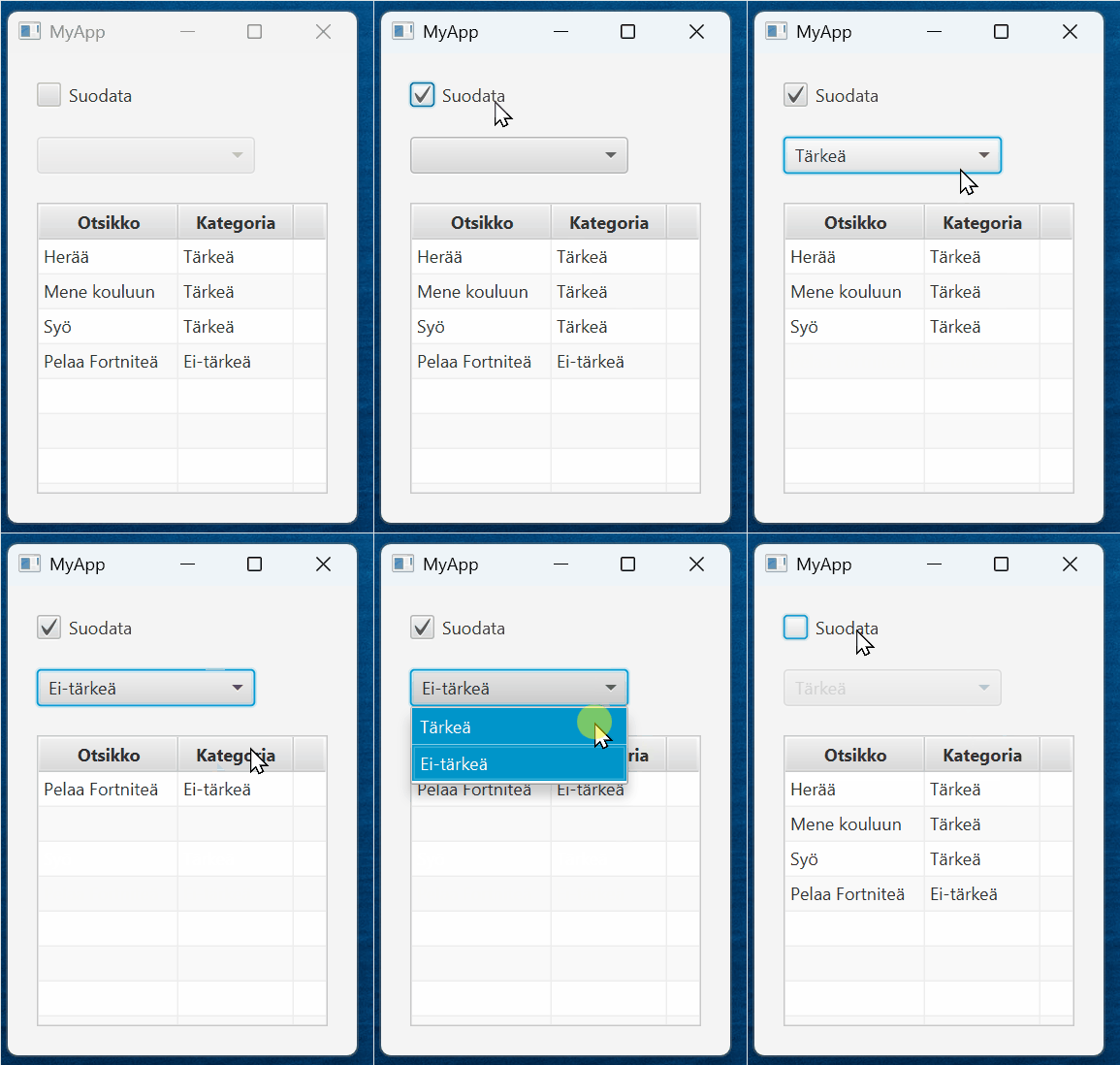
The result might look something like this.
Cell Formatting
This example can also be found in its entirety on GitHub.
Sometimes it is useful to change the appearance of a cell under certain conditions.
Continuing from the previous example, let us assume that categories can be deleted. Deleted categories should be displayed using red text so that users notice that the category has been deleted. The interface might look something like this.
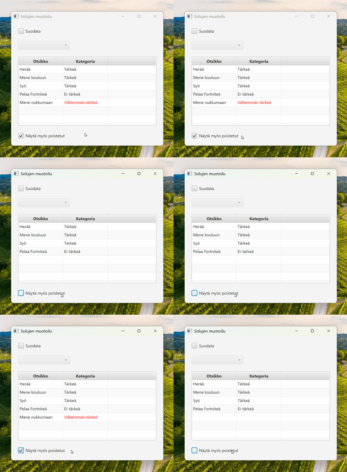
Information about whether a category has been deleted could be stored as a property of the Category class and naturally also in the JSON file. See examples of these classes in Github:
Kategoria.java,
kategoriat.json.
Of course, we could add a separate table column indicating whether a category is deleted and filter based on that. However, this is not always an elegant solution. A better idea is to indicate deleted categories directly through the category name itself, for example by displaying the text in red.
In the previous example, we added the category column like this:
categoryColumn.setCellValueFactory(cellData -> cellData.getValue().categoryProperty().asString());
This only defines where the value is retrieved from.
It cannot affect the cell's appearance.
Appearance must instead be changed using the setCellFactory() method, as we learned in Part 8.2.
Unfortunately, there is no ready-made CellFactory implementation that changes text color.
We therefore have two options:
- Create our own
CellFactoryclass by extendingTableCell. - Use a lambda expression.
The first option is more work, but useful if the same logic is required in multiple columns or tables. In this case, however, we only need to customize a single column, so a lambda expression is sufficient.
categoryColumn.setCellFactory(column -> {
    return new TableCell<Task, String>() {
        @Override
        protected void updateItem(String item, boolean empty) {
            super.updateItem(item, empty);
            if (item == null || empty) { // Empty cells must be handled separately
                setText(null);
                setStyle("");
            } else {
                setText(item); // Get the data object for the current row
                Task task = getTableRow().getItem();
                if (task != null && task.getCategory().isDeleted()) {
                    setStyle("-fx-text-fill: red;");    // Sets deleted text red
                } else {
                    setStyle("");   // Sets the default style
                }
            }
        }
    };
});
The basic idea is to override the updateItem() method of TableCell.
This method is called whenever the content or appearance of a cell needs updating, for example when the table is rendered or when the cell value changes.
By overriding updateItem(), we can define exactly how a cell's content and appearance are updated.
Let's also add a checkbox that allows the user to show or hide deleted categories. By default, this checkbox should be disabled, and only tasks belonging to non-deleted categories should be shown.
@FXML
private CheckBox showDeletedCategoriesCheckBox;

// ...

public void initialize(URL url, ResourceBundle resourceBundle) {
    // ...

    showDeletedCategoriesCheckBox.setOnAction(event -> {
        if (showDeletedCategoriesCheckBox.isSelected()) {
            filteredTasks.setPredicate(t -> true); // Show all
        } else {
            updateFilter();
        }
    });

    // ...
}

@FXML
private void updateFilter() {
    Category selectedCategory = selectCategoryComboBox.getSelectionModel().getSelectedItem();
    if (filterCheckBox.isSelected() && selectedCategory != null) {
        filteredTasks.setPredicate(t -> t.getCategory().getName().equals(selectedCategory.getName()));
    } else {
        // Show all tasks that do not belong to deleted categories
        filteredTasks.setPredicate(t -> !t.getCategory().isDeleted());
    }
}
The "show deleted categories" checkbox should be disabled whenever other filtering is active.
showDeletedCategoriesCheckBox.disableProperty().bind(filterCheckBox.selectedProperty());
As a consequence, the "show deleted categories" checkbox should also be reset whenever filtering changes.
filterCheckBox.selectedProperty()
        .addListener((obs, oldValue, newValue) ->
        showDeletedCategoriesCheckBox.setSelected(false));